
By Eric Wells
Redrawing school boundaries forces districts to balance many competing priorities: enrollment capacity, racial and economic equity, transportation logistics, and community expectations. A boundary that balances student numbers may inadvertently segregate by race. Efforts to equalize economic demographics can lengthen bus rides. Parents worry about disruptions to their children’s education. Without clear data and thoughtful communication, the process can quickly become contentious and discouraging.
At Muskogee Public Schools, we discovered that transparent communication, solid data, and tools that make that data easy to understand turn rezoning from a fraught task into an opportunity to improve the district. With the right approach, stakeholders move from resistance to collaboration, and planners uncover possibilities they hadn’t considered.
Show, Don’t Tell
We recently initiated a redraw of our attendance zones due to declining enrollment. Falling birth rates and an increasing number of families choosing alternatives such as online and charter schooling left us with fewer students. As a result, we closed one elementary school and converted its building into a dedicated sixth-grade center, and we closed a middle school entirely. Our system now operates with five elementary schools serving roughly 2,700 students.
To guide the process, our long-range planning committee—35 community members appointed by the school board, superintendent, and local leaders—adopted a geographic information system (GIS) to ensure accuracy and clarity. We selected ONPASS® Pro from Educational Data Systems, a vendor we’ve trusted for years.
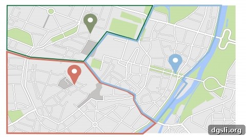
Mapping the data revealed insights we hadn’t anticipated. One school that everyone assumed was a traditional neighborhood school turned out to be sustained largely by intra-district transfers. The surrounding neighborhood’s population had aged; in fact, only about 80 students actually lived inside that school’s official zone, while roughly 65 percent were transfers. Visualizing this on a map made the imbalance unmistakable.
Using the GIS, we quickly modeled multiple scenarios. We developed five different redistricting plans, presented each to the planning committee, and solicited community feedback. The visual scenarios helped stakeholders understand trade-offs and led to a final boundary layout that better reflected neighborhood realities.
We faced a separate challenge in balancing economic diversity. Like many districts, we have concentrated pockets of low-income housing. We did not want any single school to carry a disproportionate share of socioeconomic disadvantage. The mapping tool allowed us to model boundaries that distributed students more equitably across schools while still respecting neighborhood geography and capacity constraints.
Technically, adjusting the zones was straightforward. The harder task was managing emotions: families resist changes that affect where their children will attend school. However, when the data and maps were made public, the rationale for changes became clear. People could see the underlying facts and the consequences of different options, and that transparency reduced opposition and built consensus.
For example, residents were surprised to learn that one elementary school’s zone covered 45 percent of the district’s land. Once they viewed the map, it was obvious why such a large geographic area had been required—there simply weren’t many students living in that portion of town. Seeing the reality at a glance made acceptance of adjustments much easier.
Finding New Opportunities in the Data
Beyond creating fairer attendance zones, the project revealed new district opportunities. One economically challenged school we planned to feed into other buildings presented a chance to reinvent the site as a magnet focused on project-based learning. Converting it to a magnet program could change the school’s culture, attract a broader student base, and potentially spark neighborhood revitalization.
We also gained a much better understanding of transportation needs. Although the GIS tool wasn’t explicitly designed for routing, by layering student residence locations and bus rider data we identified inefficiencies and patterns we had previously missed. This combination of transportation and demographic data gives us the ability to optimize routes, reduce travel times, and control costs—important benefits for families and the district alike.
Ultimately, the school board makes the final boundary decisions, but the best decisions reflect an informed public. Keeping the community engaged with clear maps, accurate data, and multiple vetted scenarios fosters trust and leads to outcomes that better serve students, families, and the broader district.
About the Author
Eric Wells is the chief admissions officer for Muskogee Public Schools. He can be reached at [email protected].
This article was originally published by The Learning Counsel, a research institute and news media hub focused on explaining the shift in education toward digital curriculum and data-driven decision-making.